forms and conventions of real media products?
Conventions of a music video:

Conventions of the grime genre
Mise-en-scene:
Looking a the locations of where grime music video’s are filmed, it is obvious that they are mostly set in the streets of cities where the artist’s were most likely to have grown up in. A prime example of artist’s using this location is Chip - Run Out Riddim, set on the dark streets of Tottenham where he was born and raised. Typically, grime artists in video's wear casual clothing consisting of puffer jackets and matching tracksuits, and use props that link in with the lyrics.
'Don't Worry About Me': Location's
The locations that were chosen to shoot my music video all link together well and follow the generic conventions of existing grime music video's. I was able to work with a collection of scenes consisting of high streets, empty back streets, alley's and car parks. I found that the variety of of locations helped to create a sense of realism making it look similar to an existing grime music video.
Ealing Car Park:
Perfect location to capture the characters surroundings, the vibrant blue colours of the car park contrasted with dark sky looking extremely cinematic.

Alley way:
A dark and eerie location, common of the grime genre.
1. Domestic location:
2. Block of flats:
Typical of grime videos that a narrative, story like structure. Helps to show the progression of time from when the artist is at home to what they get up to when they leave.
Blocks of flats are usually seen in grime videos, it order to show an urban location.
 |
 |
Props
Initially, this was my plan for what props I wanted to use in the music video. However, due to a very low budget, I was only able to get some of the items. Nonetheless, I still found that some of the props used in the overall final cut of the music video were successful in creating a realistic grime video.
 |
| Initial ideas for props |
Props used
Subverting the grime genre conventions
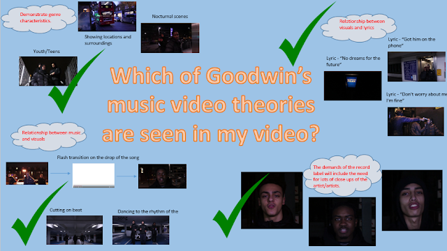
A convention seen in numerous grime videos is the connotation of youths running into trouble with the law for committing criminal offences. I did not include this as I believed it would have a more powerful impact if the youths in my video would challenge the stereotype, and instead want to make something of themselves. This is clearly shown in my music video when the main artist says "Low life MC's, no dreams for the future....can't you see i'm going to beat them" and on screen is recording of a police van. Here are some example of grime artists that included the stereotype of London youths in their videos....
Krept and Konan - Dunya
Bugzy Malone - Section 81
Cadet - 100 Phone Calls
Music Video - Technical Conventions
Ancillary Texts
Final Digipak

Final Magazine Advert

After researching real media print products in the grime genre, I created this digipak/poster in order to conform to the grime conventions and create a realistic finish.
Q1 from Giordano Boscarelli
The grime genre is very versatile, therefore when it came to making the Digipak and magazine advert I was not restricted. It was crucial for my advert to include clear, bold fonts and colour in contrast to my black and white Digipak, sticking with the original grime album cover conventions.
Image choice
In most of my digipak images, the location shots and any photos without the artist are edited to are edited to be in black and white. I wanted this to relate to the grime genre of music itself, it shows that grime is a raw genre of music and lyrics come form the heart of the artist, they do not need bright colours and hugely edited images for their music to be impactful. In contrast to this, I wanted the text to stand out from the photograph so that it would be easily read.
Font and Design
Keeping the fonts and colours of the text the same for the entire digipak was important to make my digipak look professional whilst still conforming to the genre of Grime. Again, I researched real Grime album covers to guide me with the design.


No comments:
Post a Comment